Overview
VendorOS is a vendor lifecycle management platform handling the full journey from onboarding a new vendor through active management to offboarding across multiple departments and stakeholders. The system serves five distinct user roles, each with different responsibilities, permissions, and goals. The design challenge wasn't just the complexity of each role, it was making them work as a coherent system.
THE PROBLEM
The "before" state
- The vendor lifecycle had no single home.
- Information lived across emails and disconnected platforms, duplicated, mismatched, and hard to trace.
- With no central record or visibility into progress.
- a process that should be straightforward was taking up to six months to complete
- costing millions in delayed projects every year.
If a user can't tell what the system did, why, and what to do next, it doesn't matter how smart it is.
Research
ResearchTalking to the People in the Process
To understand the problem before touching any design, I ran interviews with around 20 people across four groups: leadership, program managers, government program managers, and contractor employees. Sessions were small 1:1s and groups of two or three starting with open questions to let people describe their own processes, then refining follow-up questions based on what emerged.
The frustration was consistent across every level:
"These processes are taking forever and we can't afford to make a security mistake."
"Time is money and we are losing lots."
"Projects get delayed needlessly due to these long onboarding processes."
One finding stood out: users weren't resistant to change, they were willing to contribute and wanted the platform to work. But they had one firm requirement: certain forms had to look and feel familiar. Changing the visual structure of forms they'd used for years wasn't an option.
That shaped the approach from day one, improve the system around the forms, not the forms themselves.
Research
Finding the Real Problem
Mapping the existing processes revealed the real problem underneath the chaos: people weren't just missing information — they were missing context. They didn't know where they stood in the process, whether they needed to act, wait, or do nothing. They were executing isolated tasks with no visibility into the whole.
The core insight that drove every design decision:
Make every user a participant in the full process, not just an executor of their own task.
Clear statuses, transparent progress, and explicit ownership at every stage that became the foundation.
From the process mapping I also identified something that wasn't in the original brief: notifications and assigned tasks were as important as the screens themselves. I designed a dedicated My Tasks section so each user could see exactly what they had pending and a sub-section showing other users' pending tasks that would directly affect their own work. Visibility across roles, not just within them.

Research
Design Process
Swim lane diagrams making the system visible. Early in the process I moved to swim lane diagrams in Figma to map how responsibility moved between roles at each stage of the lifecycle. This was the turning point for the team, seeing the handoffs visually made it clear how easily the process could stall when one role didn't act, and how critical status visibility was to keep things moving.
It directly led to one of the key interface decisions: a status tracker in a drawer component, accessible from any view, showing exactly where a vendor record sat in the process and who owned the next step.
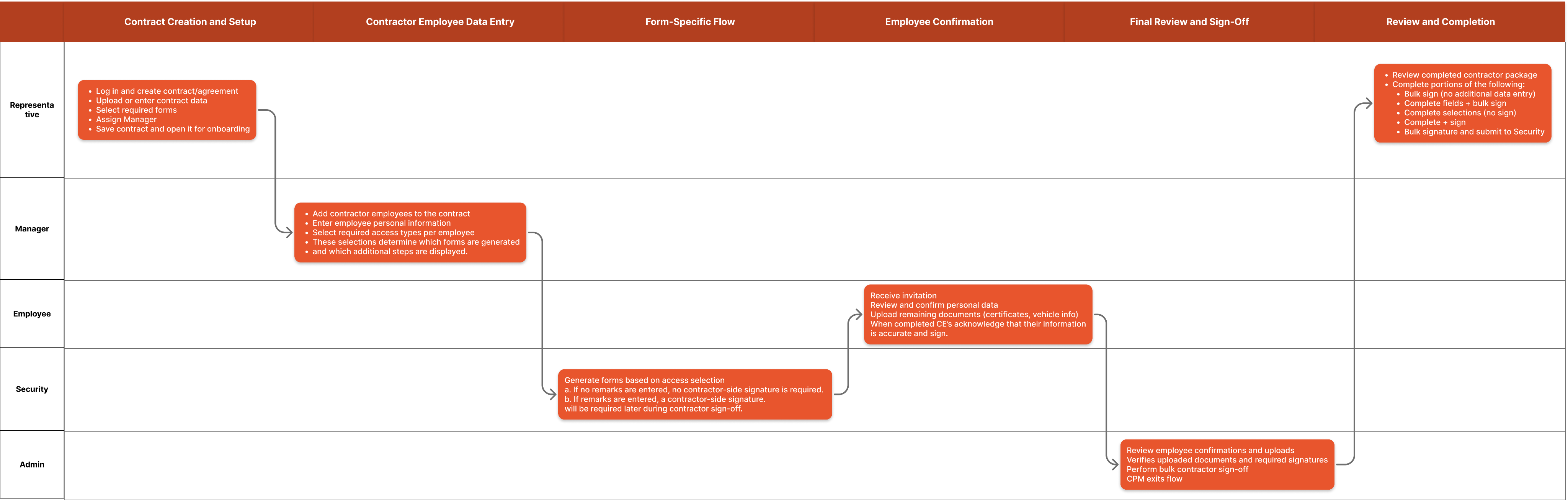
Swim lane diagram mapping how process responsibility moves across roles — the foundation for the status tracker design.
Research
Roles architecture
The five roles were already well defined by the client. What wasn't defined was how to give each role a focused experience without fragmenting the system.
Each dashboard was designed around one question: what does this role need to act on right now?
Admin — system-wide status, access control, pending approvals
Vendor Manager — active vendors, onboarding progress, expiring agreements
Operations Lead — task queue, bottlenecks, completion rates
Compliance Officer — form status, outstanding signatures, audit trail
Procurement Manager — contract stages, document extraction, upcoming renewals
- Admin: System-wide status, access control, pending approvals
- Vendor Manager: Active vendors, onboarding progress, expiring agreements
- Operations Lead: Task queue, bottlenecks, completion rates
- Compliance Officer: Form status, outstanding signatures, audit trail
- Procurement Manager: Contract stages, document extraction, upcoming renewals
The five roles were already well defined by the client. What wasn't defined was how to give each role a focused experience without fragmenting the system.
Each dashboard was designed around one question: what does this role need to act on right now?
Admin — system-wide status, access control, pending approvals
Vendor Manager — active vendors, onboarding progress, expiring agreements
Operations Lead — task queue, bottlenecks, completion rates
Compliance Officer — form status, outstanding signatures, audit trail
Procurement Manager — contract stages, document extraction, upcoming renewals
Research
Role architecture — five roles, one coherent system
One of the most valuable decisions on this project was also the most uncomfortable: removing sections from an earlier version of the platform.
Features like "all contracts" and "all employees" broad, unfiltered views had been built with the assumption that some users might need them. Testing showed they didn't. Instead of providing clarity, they created noise and implied a level of control that didn't match how users actually worked.
Removing them made the platform more focused and more trustworthy. It was the right call, but it required conviction and a clear rationale grounded in what users had actually told us.
Research
Familiar by design
Given users' strong preference for form familiarity, the approach was to improve around the form, not the form itself. Key changes:
- Auto-population of known fields from the vendor record
- Clear multi-step progress indicators
- Inline validation to catch errors before submission
- Auto-population of known fields from the vendor record
- Clear multi-step progress indicators
- Inline validation to catch errors before submission
Research
AI-Assisted Document Extraction
Procurement Managers were manually reading vendor agreements and transferring data into the system a slow, error-prone process with real compliance stakes.
The solution: a drag-and-drop extraction feature. Drop in a vendor agreement and the system identifies and pulls key fields contract terms, personnel, required compliance documents, vendor data directly into the record.
The design challenge wasn't building the feature. It was making people trust it.
Three principles guided every decision:
- Evidence-first: Every extracted field links back to its exact source in the document. Users can see why the system reached each conclusion.
- Human-in-the-loop: Nothing commits until the user reviews and confirms. The AI assists. It never decides.
- Conservative by design: When confidence is low, the system flags it rather than guessing. The interface never implies certainty it doesn't have.
Research
ValidationClosing the Feedback Loop
Before launch, I proposed embedding a floating feedback widget directly in the platform giving end users a way to flag issues, bugs, or suggestions in context, exactly where they encountered them. All submissions fed into Jira for the team to review and prioritize.
It surfaced something we hadn't caught in testing: several tables were displaying more information than users needed. The extra columns weren't helping, they were adding cognitive load. We trimmed them based directly on that feedback.
It's a small change, but it's the kind of thing you only find when real users are working with a real product. Building that loop in early was worth it.
Reflection
ReflectionWhat I'd Do Differently
This project reinforced how different "same role" can look depending on the person holding it. Five roles on paper became ten different ways of thinking about information in practice some users wanted every detail, others needed a single clear action. Designing for that range, within one coherent system, was the hardest and most rewarding part.
If I could do one thing differently: resist the pressure to jump to solutions early. There were moments where stakeholders pushed for answers before the problem was fully understood. I found ways to work through it, but holding that space for proper definition, even briefly, would have saved time and avoided early wireframes that had to be scrapped. The irony is that slowing down would have made us faster.
Overview
VendorOS is a vendor lifecycle management platform handling the full journey from onboarding a new vendor through active management to offboarding across multiple departments and stakeholders. The system serves five distinct user roles, each with different responsibilities, permissions, and goals. The design challenge wasn't just the complexity of each role, it was making them work as a coherent system.
THE PROBLEM
The "before" state
- The vendor lifecycle had no single home.
- Information lived across emails and disconnected platforms, duplicated, mismatched, and hard to trace.
- With no central record or visibility into progress.
- a process that should be straightforward was taking up to six months to complete
- costing millions in delayed projects every year.
If a user can't tell what the system did, why, and what to do next, it doesn't matter how smart it is.
Research
ResearchTalking to the People in the Process
To understand the problem before touching any design, I ran interviews with around 20 people across four groups: leadership, program managers, government program managers, and contractor employees. Sessions were small 1:1s and groups of two or three starting with open questions to let people describe their own processes, then refining follow-up questions based on what emerged.
The frustration was consistent across every level:
"These processes are taking forever and we can't afford to make a security mistake."
"Time is money and we are losing lots."
"Projects get delayed needlessly due to these long onboarding processes."
One finding stood out: users weren't resistant to change, they were willing to contribute and wanted the platform to work. But they had one firm requirement: certain forms had to look and feel familiar. Changing the visual structure of forms they'd used for years wasn't an option.
That shaped the approach from day one, improve the system around the forms, not the forms themselves.
Research
Finding the Real Problem
Mapping the existing processes revealed the real problem underneath the chaos: people weren't just missing information — they were missing context. They didn't know where they stood in the process, whether they needed to act, wait, or do nothing. They were executing isolated tasks with no visibility into the whole.
The core insight that drove every design decision:
Make every user a participant in the full process, not just an executor of their own task.
Clear statuses, transparent progress, and explicit ownership at every stage that became the foundation.
From the process mapping I also identified something that wasn't in the original brief: notifications and assigned tasks were as important as the screens themselves. I designed a dedicated My Tasks section so each user could see exactly what they had pending and a sub-section showing other users' pending tasks that would directly affect their own work. Visibility across roles, not just within them.
Research
Design Process
Swim lane diagrams making the system visible. Early in the process I moved to swim lane diagrams in Figma to map how responsibility moved between roles at each stage of the lifecycle. This was the turning point for the team, seeing the handoffs visually made it clear how easily the process could stall when one role didn't act, and how critical status visibility was to keep things moving.
It directly led to one of the key interface decisions: a status tracker in a drawer component, accessible from any view, showing exactly where a vendor record sat in the process and who owned the next step.
Swim lane diagram mapping how process responsibility moves across roles — the foundation for the status tracker design.
Research
Roles architecture
The five roles were already well defined by the client. What wasn't defined was how to give each role a focused experience without fragmenting the system.
Each dashboard was designed around one question: what does this role need to act on right now?
Admin — system-wide status, access control, pending approvals
Vendor Manager — active vendors, onboarding progress, expiring agreements
Operations Lead — task queue, bottlenecks, completion rates
Compliance Officer — form status, outstanding signatures, audit trail
Procurement Manager — contract stages, document extraction, upcoming renewals
- Admin: System-wide status, access control, pending approvals
- Vendor Manager: Active vendors, onboarding progress, expiring agreements
- Operations Lead: Task queue, bottlenecks, completion rates
- Compliance Officer: Form status, outstanding signatures, audit trail
- Procurement Manager: Contract stages, document extraction, upcoming renewals
The five roles were already well defined by the client. What wasn't defined was how to give each role a focused experience without fragmenting the system.
Each dashboard was designed around one question: what does this role need to act on right now?
Admin — system-wide status, access control, pending approvals
Vendor Manager — active vendors, onboarding progress, expiring agreements
Operations Lead — task queue, bottlenecks, completion rates
Compliance Officer — form status, outstanding signatures, audit trail
Procurement Manager — contract stages, document extraction, upcoming renewals
Research
Role architecture — five roles, one coherent system
One of the most valuable decisions on this project was also the most uncomfortable: removing sections from an earlier version of the platform.
Features like "all contracts" and "all employees" broad, unfiltered views had been built with the assumption that some users might need them. Testing showed they didn't. Instead of providing clarity, they created noise and implied a level of control that didn't match how users actually worked.
Removing them made the platform more focused and more trustworthy. It was the right call, but it required conviction and a clear rationale grounded in what users had actually told us.
Research
Familiar by design
Given users' strong preference for form familiarity, the approach was to improve around the form, not the form itself. Key changes:
- Auto-population of known fields from the vendor record
- Clear multi-step progress indicators
- Inline validation to catch errors before submission
- Auto-population of known fields from the vendor record
- Clear multi-step progress indicators
- Inline validation to catch errors before submission
Research
AI-Assisted Document Extraction
Procurement Managers were manually reading vendor agreements and transferring data into the system a slow, error-prone process with real compliance stakes.
The solution: a drag-and-drop extraction feature. Drop in a vendor agreement and the system identifies and pulls key fields contract terms, personnel, required compliance documents, vendor data directly into the record.
The design challenge wasn't building the feature. It was making people trust it.
Three principles guided every decision:
- Evidence-first: Every extracted field links back to its exact source in the document. Users can see why the system reached each conclusion.
- Human-in-the-loop: Nothing commits until the user reviews and confirms. The AI assists. It never decides.
- Conservative by design: When confidence is low, the system flags it rather than guessing. The interface never implies certainty it doesn't have.
Research
ValidationClosing the Feedback Loop
Before launch, I proposed embedding a floating feedback widget directly in the platform giving end users a way to flag issues, bugs, or suggestions in context, exactly where they encountered them. All submissions fed into Jira for the team to review and prioritize.
It surfaced something we hadn't caught in testing: several tables were displaying more information than users needed. The extra columns weren't helping, they were adding cognitive load. We trimmed them based directly on that feedback.
It's a small change, but it's the kind of thing you only find when real users are working with a real product. Building that loop in early was worth it.
Reflection
ReflectionWhat I'd Do Differently
This project reinforced how different "same role" can look depending on the person holding it. Five roles on paper became ten different ways of thinking about information in practice some users wanted every detail, others needed a single clear action. Designing for that range, within one coherent system, was the hardest and most rewarding part.
If I could do one thing differently: resist the pressure to jump to solutions early. There were moments where stakeholders pushed for answers before the problem was fully understood. I found ways to work through it, but holding that space for proper definition, even briefly, would have saved time and avoided early wireframes that had to be scrapped. The irony is that slowing down would have made us faster.
Overview
VendorOS is a vendor lifecycle management platform handling the full journey from onboarding a new vendor through active management to offboarding across multiple departments and stakeholders. The system serves five distinct user roles, each with different responsibilities, permissions, and goals. The design challenge wasn't just the complexity of each role, it was making them work as a coherent system.
THE PROBLEM
The "before" state
- The vendor lifecycle had no single home.
- Information lived across emails and disconnected platforms, duplicated, mismatched, and hard to trace.
- With no central record or visibility into progress.
- a process that should be straightforward was taking up to six months to complete
- costing millions in delayed projects every year.
If a user can't tell what the system did, why, and what to do next, it doesn't matter how smart it is.
Research
Talking to the People in the Process
To understand the problem before touching any design, I ran interviews with around 20 people across four groups: leadership, program managers, government program managers, and contractor employees. Sessions were small 1:1s and groups of two or three starting with open questions to let people describe their own processes, then refining follow-up questions based on what emerged.
The frustration was consistent across every level:
"These processes are taking forever and we can't afford to make a security mistake."
"Time is money and we are losing lots."
"Projects get delayed needlessly due to these long onboarding processes."
One finding stood out: users weren't resistant to change, they were willing to contribute and wanted the platform to work. But they had one firm requirement: certain forms had to look and feel familiar. Changing the visual structure of forms they'd used for years wasn't an option.
That shaped the approach from day one, improve the system around the forms, not the forms themselves.
Define
Finding the Real Problem
Mapping the existing processes revealed the real problem underneath the chaos: people weren't just missing information — they were missing context. They didn't know where they stood in the process, whether they needed to act, wait, or do nothing. They were executing isolated tasks with no visibility into the whole.
The core insight that drove every design decision:
Make every user a participant in the full process, not just an executor of their own task.
Clear statuses, transparent progress, and explicit ownership at every stage that became the foundation.
From the process mapping I also identified something that wasn't in the original brief: notifications and assigned tasks were as important as the screens themselves. I designed a dedicated My Tasks section so each user could see exactly what they had pending and a sub-section showing other users' pending tasks that would directly affect their own work. Visibility across roles, not just within them.

Process
Design Process
Swim lane diagrams making the system visible. Early in the process I moved to swim lane diagrams in Figma to map how responsibility moved between roles at each stage of the lifecycle. This was the turning point for the team, seeing the handoffs visually made it clear how easily the process could stall when one role didn't act, and how critical status visibility was to keep things moving.
It directly led to one of the key interface decisions: a status tracker in a drawer component, accessible from any view, showing exactly where a vendor record sat in the process and who owned the next step.
Swim lane diagram mapping how process responsibility moves across roles — the foundation for the status tracker design.
Roles architecture
The five roles were already well defined by the client. What wasn't defined was how to give each role a focused experience without fragmenting the system.
Each dashboard was designed around one question: what does this role need to act on right now?
- Admin: System-wide status, access control, pending approvals
- Vendor Manager: Active vendors, onboarding progress, expiring agreements
- Operations Lead: Task queue, bottlenecks, completion rates
- Compliance Officer: Form status, outstanding signatures, audit trail
- Procurement Manager: Contract stages, document extraction, upcoming renewals
A key insight from the interviews: not every role wants information the same way. Some needed full detail. Others needed a quick summary and a clear next action. Dashboards were designed to reflect that same data, different lenses.
Wireframes as a thinking tool
One of the most valuable decisions on this project was also the most uncomfortable: removing sections from an earlier version of the platform.
Features like "all contracts" and "all employees" broad, unfiltered views had been built with the assumption that some users might need them. Testing showed they didn't. Instead of providing clarity, they created noise and implied a level of control that didn't match how users actually worked.
Removing them made the platform more focused and more trustworthy. It was the right call, but it required conviction and a clear rationale grounded in what users had actually told us.
Form UX
Familiar by design
Given users' strong preference for form familiarity, the approach was to improve around the form, not the form itself. Key changes:
- Auto-population of known fields from the vendor record
- Clear multi-step progress indicators
- Inline validation to catch errors before submission
AI-ASSISTED UX
AI-Assisted Document Extraction
Procurement Managers were manually reading vendor agreements and transferring data into the system a slow, error-prone process with real compliance stakes.
The solution: a drag-and-drop extraction feature. Drop in a vendor agreement and the system identifies and pulls key fields contract terms, personnel, required compliance documents, vendor data directly into the record.
The design challenge wasn't building the feature. It was making people trust it.
Three principles guided every decision:
- Evidence-first: Every extracted field links back to its exact source in the document. Users can see why the system reached each conclusion.
- Human-in-the-loop: Nothing commits until the user reviews and confirms. The AI assists. It never decides.
- Conservative by design: When confidence is low, the system flags it rather than guessing. The interface never implies certainty it doesn't have.
Validation
Closing the Feedback Loop
Before launch, I proposed embedding a floating feedback widget directly in the platform giving end users a way to flag issues, bugs, or suggestions in context, exactly where they encountered them. All submissions fed into Jira for the team to review and prioritize.
It surfaced something we hadn't caught in testing: several tables were displaying more information than users needed. The extra columns weren't helping, they were adding cognitive load. We trimmed them based directly on that feedback.
It's a small change, but it's the kind of thing you only find when real users are working with a real product. Building that loop in early was worth it.
Reflection
What I'd Do Differently
This project reinforced how different "same role" can look depending on the person holding it. Five roles on paper became ten different ways of thinking about information in practice some users wanted every detail, others needed a single clear action. Designing for that range, within one coherent system, was the hardest and most rewarding part.
If I could do one thing differently: resist the pressure to jump to solutions early. There were moments where stakeholders pushed for answers before the problem was fully understood. I found ways to work through it, but holding that space for proper definition, even briefly, would have saved time and avoided early wireframes that had to be scrapped. The irony is that slowing down would have made us faster.